Whimsical bakes, warm vibes, and a growing brand
Pinecone Bakeshop came to Elio at a pivotal moment of growth. After building a loyal following through pop-ups and seasonal bakes, they were opening their first brick-and-mortar location and needed a brand that reflected their evolution. They wanted to preserve the cozy, neighborly charm their fans loved while stepping into a more polished identity that could support packaging, merchandise, and future expansion. We created a joyful, personality-filled logo, an earthy and inviting color palette, and a warm, approachable voice. We also built a fully custom, accessible website with playful animations, handcrafted copy, and craveable imagery—bringing Pinecone’s charm to life and setting them up for what’s next.
Brand Identity
A distinctive brand, true to Pinecone’s spirit
We designed two logos to represent Pinecone Bakeshop: a horizontal wordmark and a pinecone emblem. Both express the warmth and comfort of their delicious baked goods, while the playful, funky silhouettes and letterforms celebrate the bakery’s creative, seasonal flavors. The custom-drawn type gives each logo a distinctive personality, perfectly capturing Pinecone’s unique style. Each mark was thoughtfully crafted to perform beautifully across all touchpoints - from signage and menus to web, packaging, and merchandise.


“I couldn’t be happier with the branding and website Eilo designed for my bakeshop! They completely nailed the vibe I envisioned for the brand and brought it to life with cool animations and transitions on the website that I’m absolutely in love with.”
Joyce Hsieh
Founder, Pinecone Bakeshop
Web Design & Development
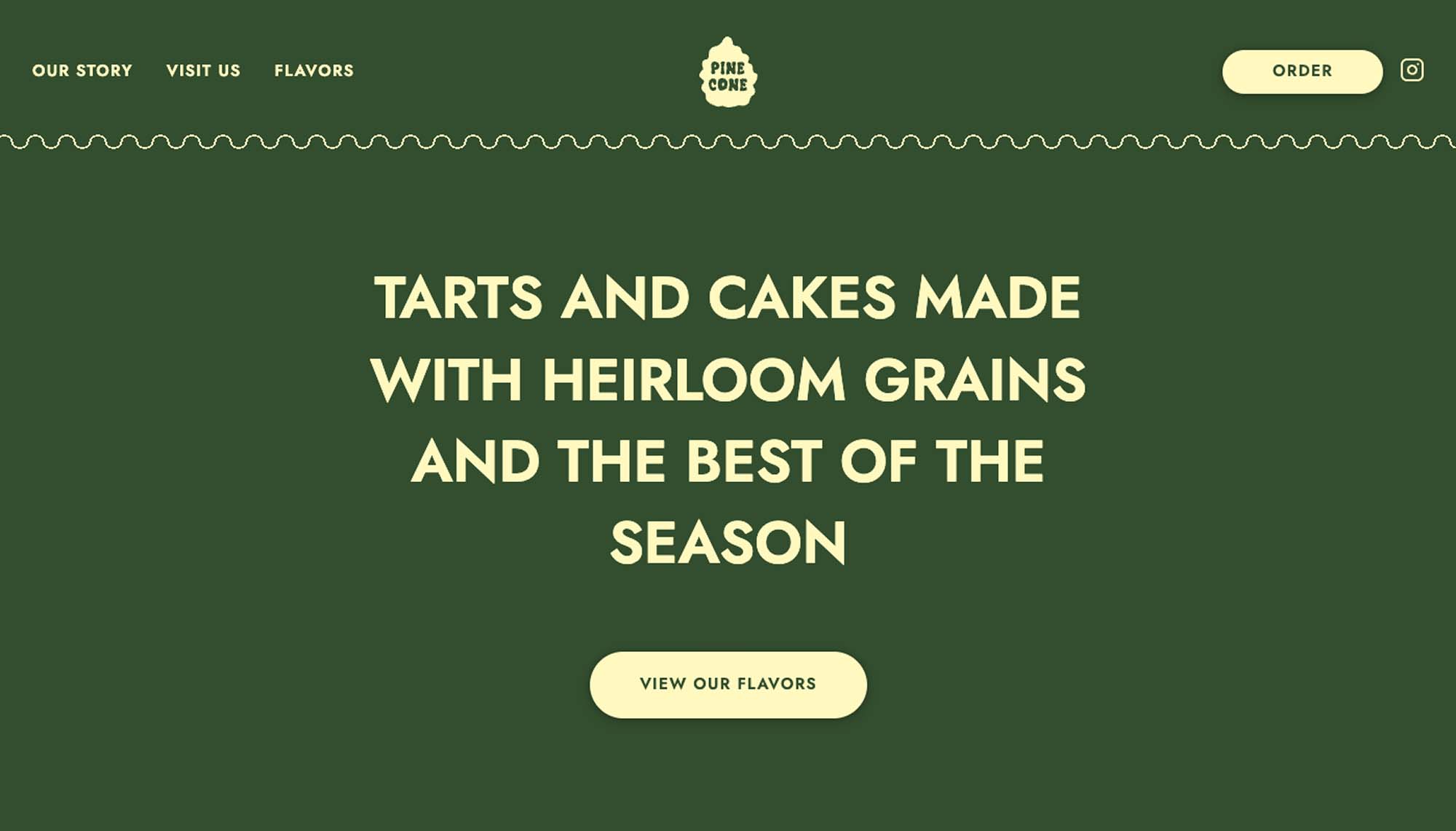
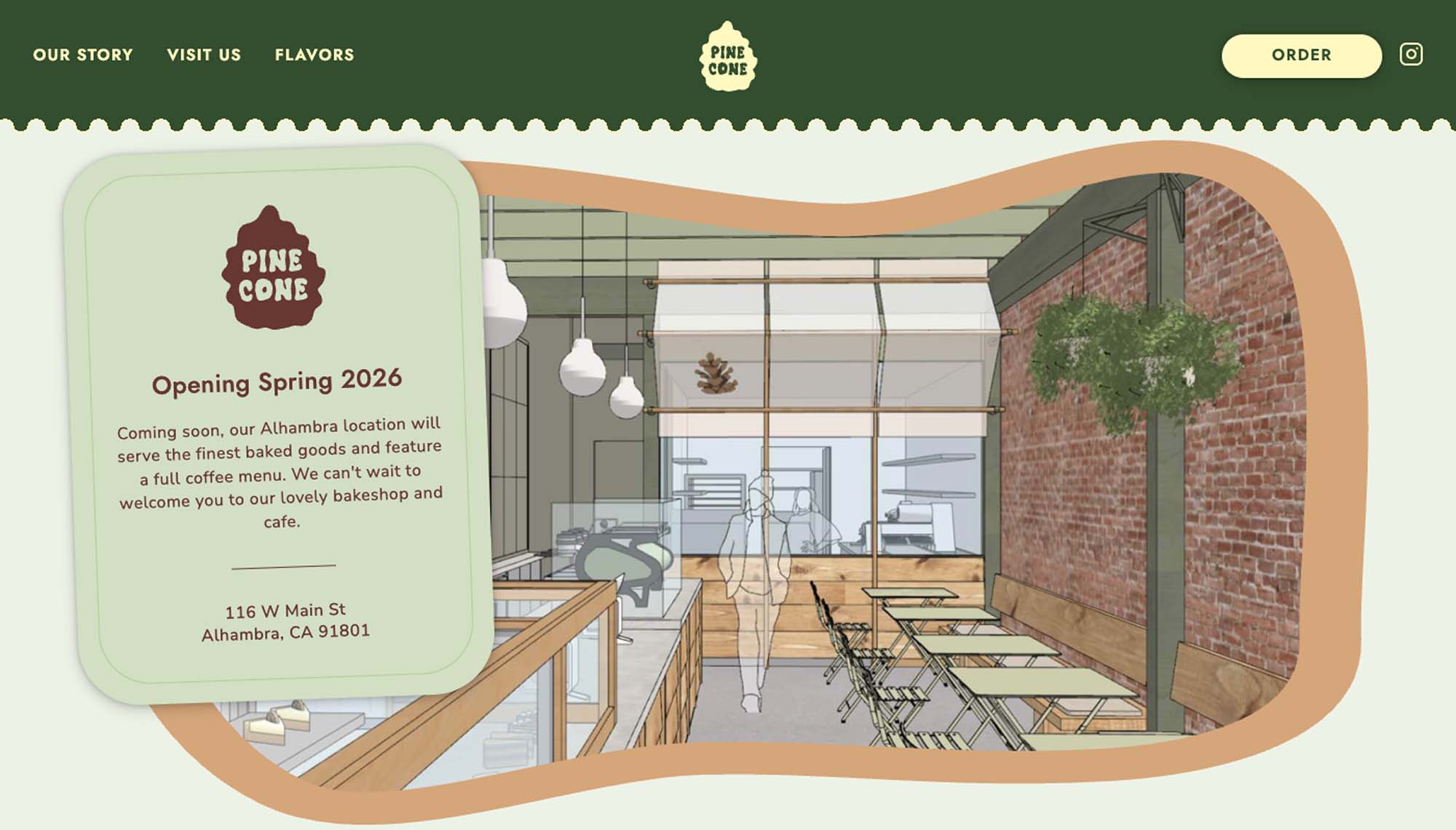
An organic, whimsical, and elegant website
We designed Pinecone’s website to feel warm, inviting, and effortlessly welcoming. The color palette, inspired by nature’s earthy tones and seasonal hues, creates a comforting, organic foundation. Playful organic shapes echo the brand’s whimsical personality, seamlessly tying the digital experience to the visual identity. Under the hood, modern web technologies ensure the site is fast and lightweight, while still delivering a rich, engaging experience that encourages visitors to explore and connect.
Dynamic Animation
Fluid animations, flavorful journeys
We brought Pinecone’s personality to life through fun, fluid animations that add depth and delight to every interaction. The playful intro animation sets the tone for the brand and invites visitors into the experience from the very first moment. On the flavors page, subtle motion and gentle color transitions guide visitors through each offering, creating a dynamic, immersive journey that lets them explore Pinecone’s creative flavors in an entirely new way.